Since 1991 Van Deelen Liften has grown into an important player in lift maintenance and renovation in the Rotterdam and The Hague region. With dedication they ensure better lift performance and satisfied lift users. But when you have such a wonderful story to tell, it is also important to share this in the right way. Vandeez and Van Deelen Liften have joined forces for a rebranding, with the aim of preparing look and preparing talent and preparing the brand for the future.
client
Van Deelen Liften
services
Brand positioningbrand identitywebsite
approach
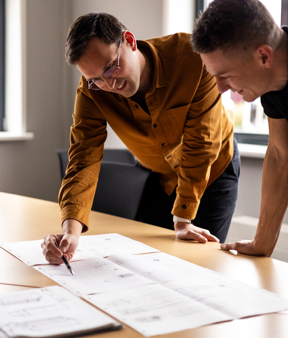
We started the brand positioning, where we came to the core of their story with strategic sessions and interviews with employees and customers.
mission and brand promise
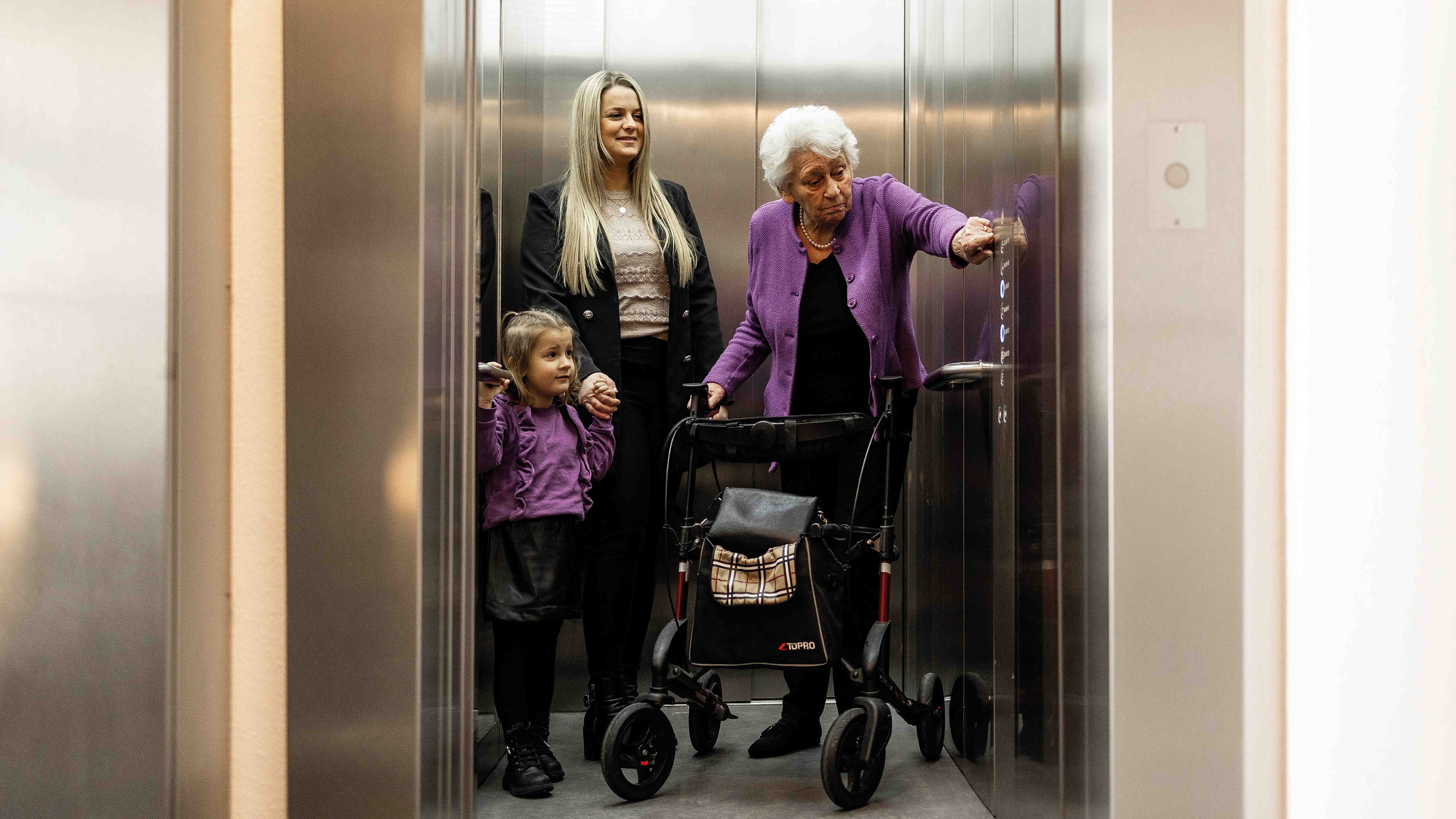
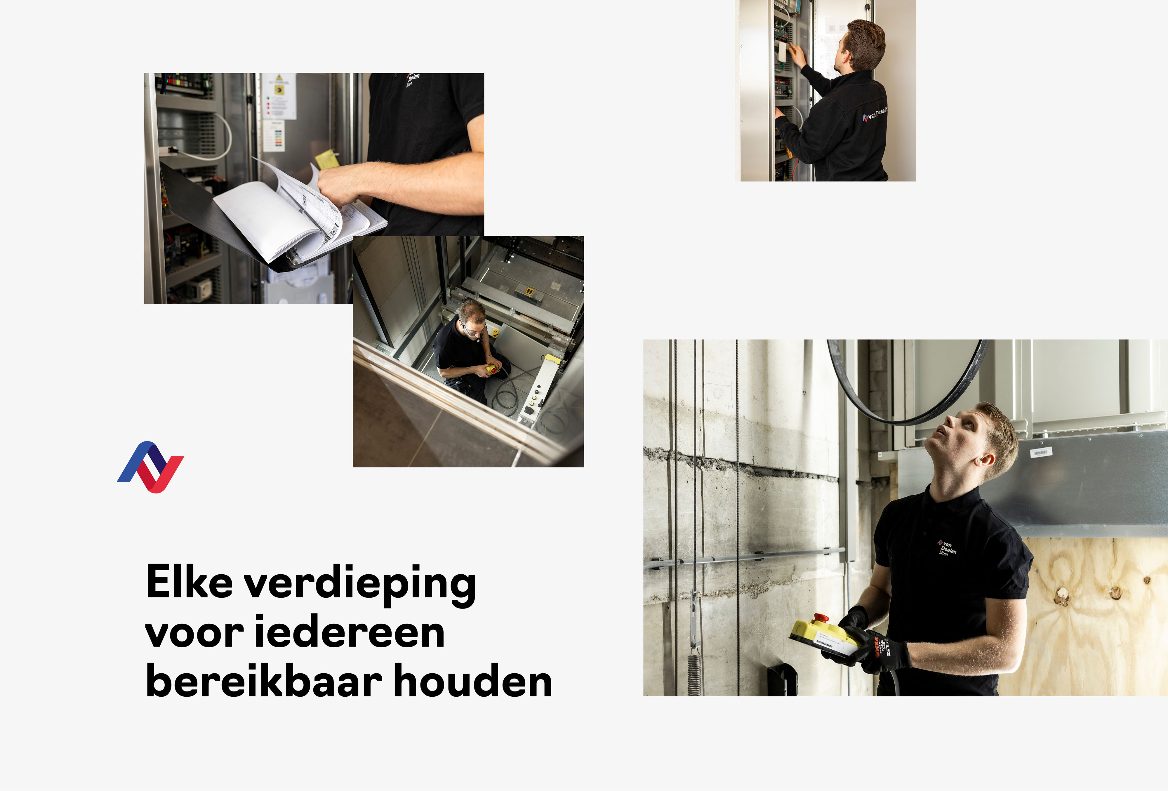
The mission "keep every floor accessible to everyone" and the promise "certainty on every floor" reflect the dedication of Van Deelen Liften to reliable lift performance. With Van Deelen Liften as a partner, grandma effortlessly reaches the top floor, heavy groceries do not have to go up with the stairs and people always reach their destination carefree. Van Deelen Liften distinguishes itself through attention and better lift performance.
brand identity that speaks
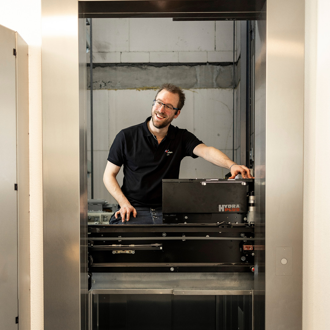
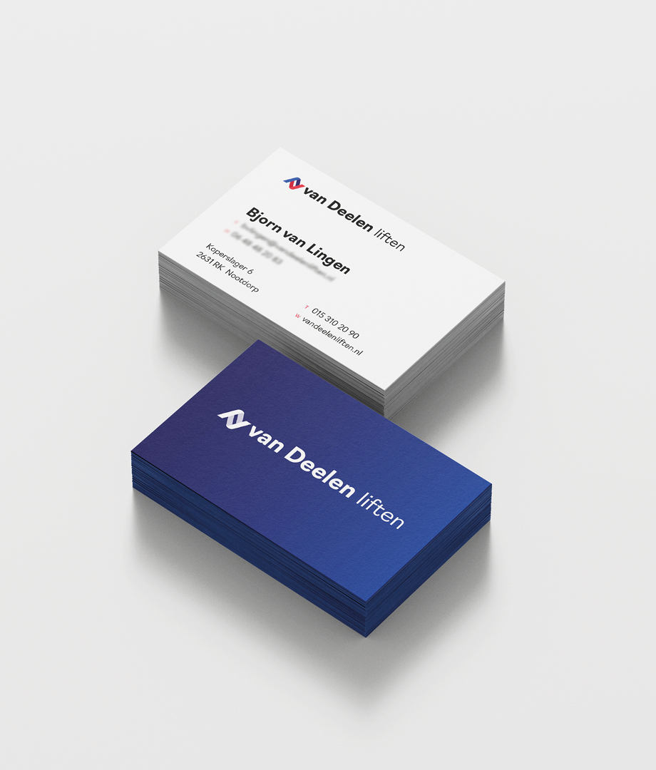
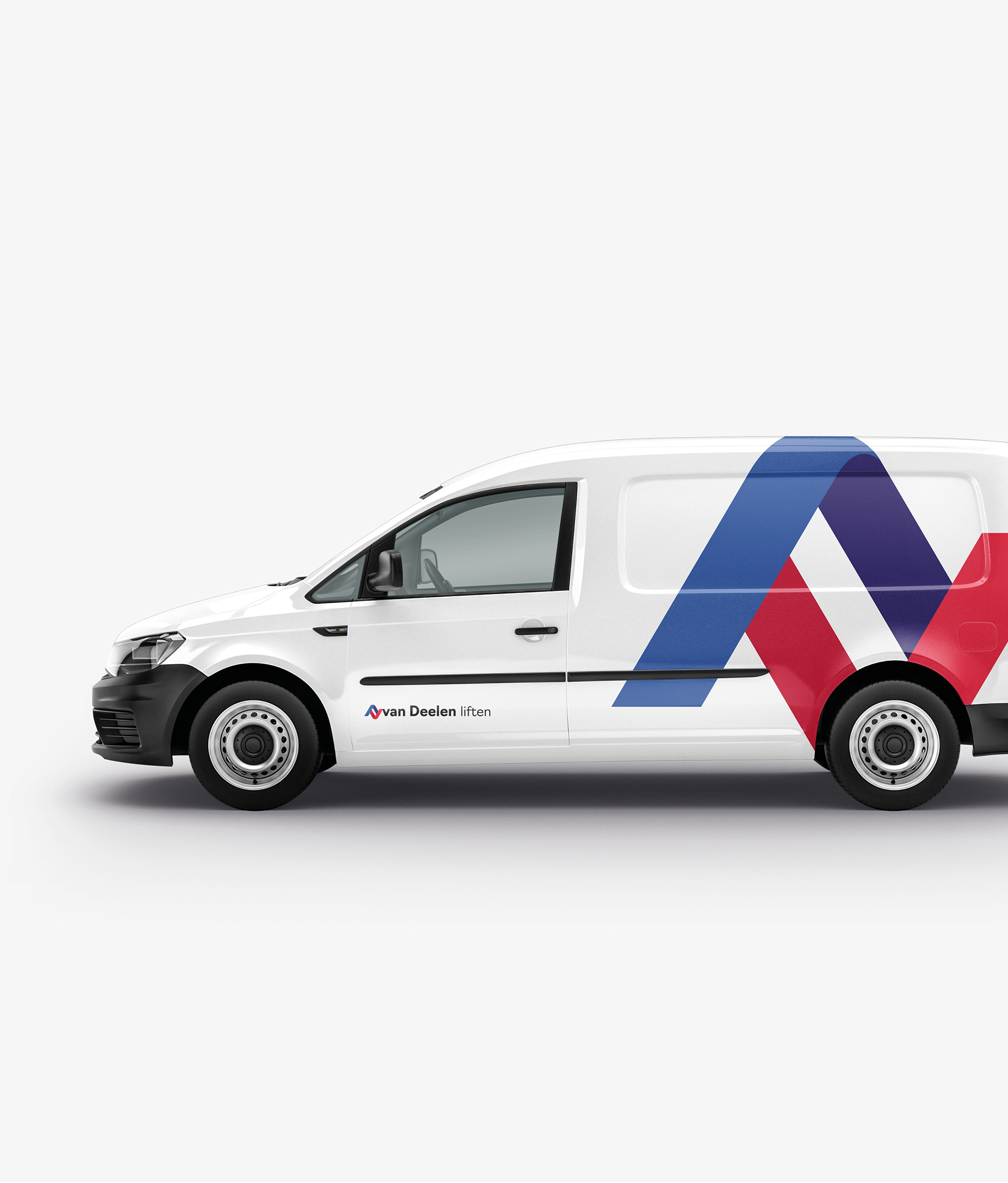
The brand identity of Van Deelen Liften underwent a contemporary redesign while retaining the recognizable blue and red colors. The up and down arrows in the new logo symbolize both the movement of lifts and the dedication to raise customer satisfaction to new heights. In this way the brand identity immediately appeals to the target group. In addition to the logo and the visual identity photography has also been renewed, and we have realized various brand expressions.
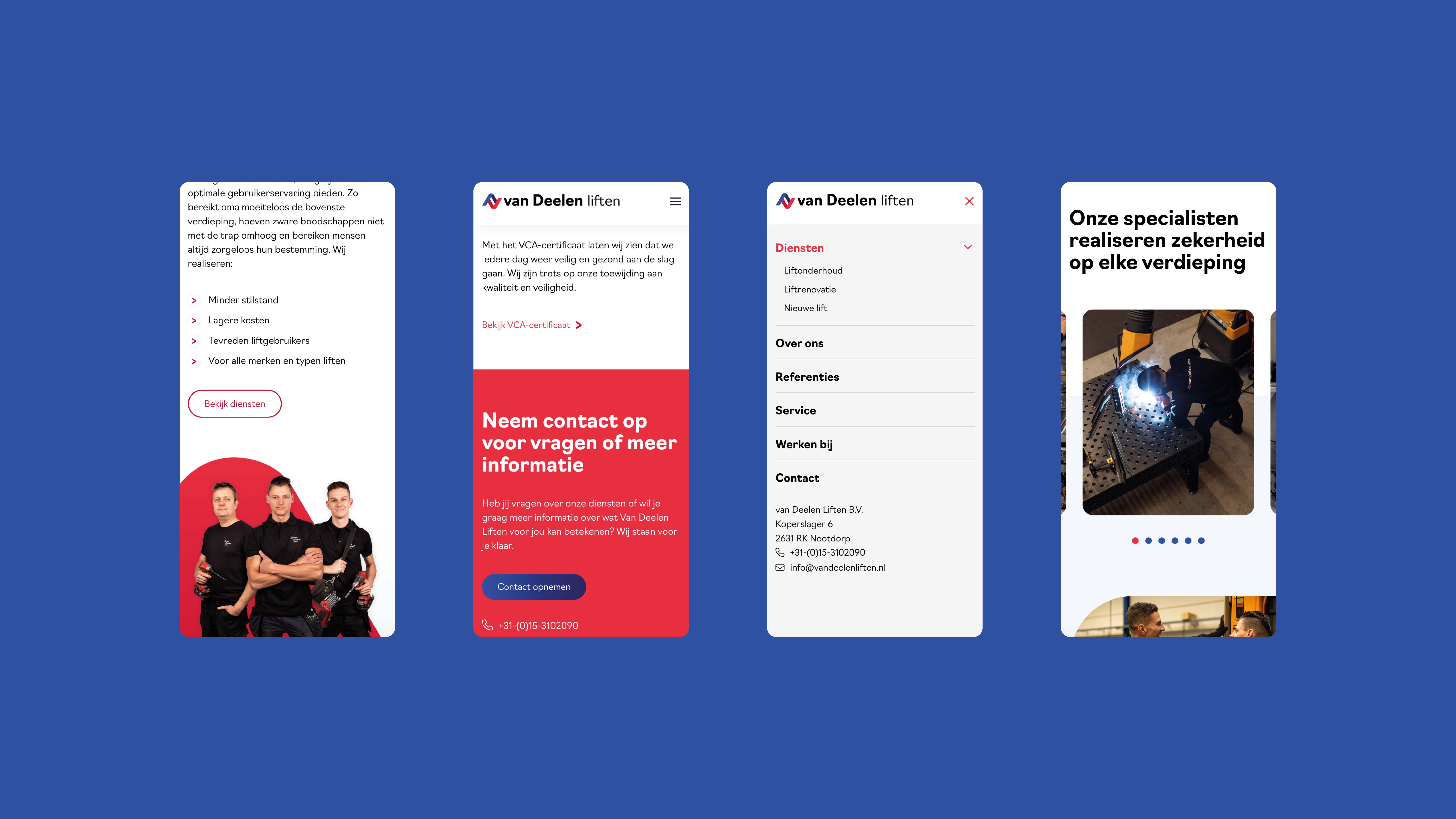
Website that convinces
The rebranding comes to life on the renewed website, where not only the right story is told to customers, but new talent is also attracted. The website tells what Van Deelen Liften stands for, provides insight into their services and presents tangible results of their work. Potential customers are convinced of the expertise of Van Deelen Liften, and potential employees see a personal family business that they would like to work with.
result
With the rebranding Van Deelen Liften are ready for the future. They not only have the right story, but also the right look and the required tools to communicate this strongly. It has been an inspiring collaboration with an end result that everyone can rightly be proud of.
"With the new look and website we transfer our story more powerfully and we attract the right talent."
Bjorn van Lingen - Planner / Work planner
Bjorn van Lingen - Planner / Work planner
About Van Deelen Liften
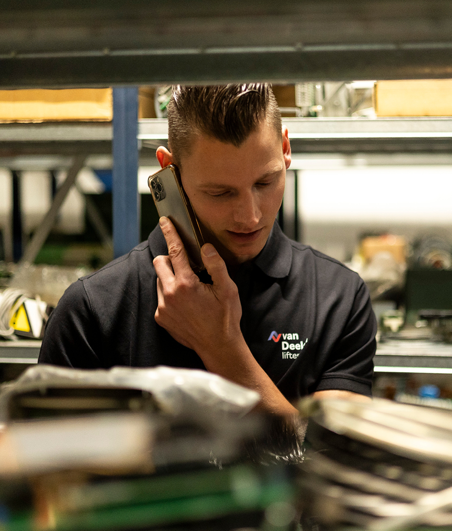
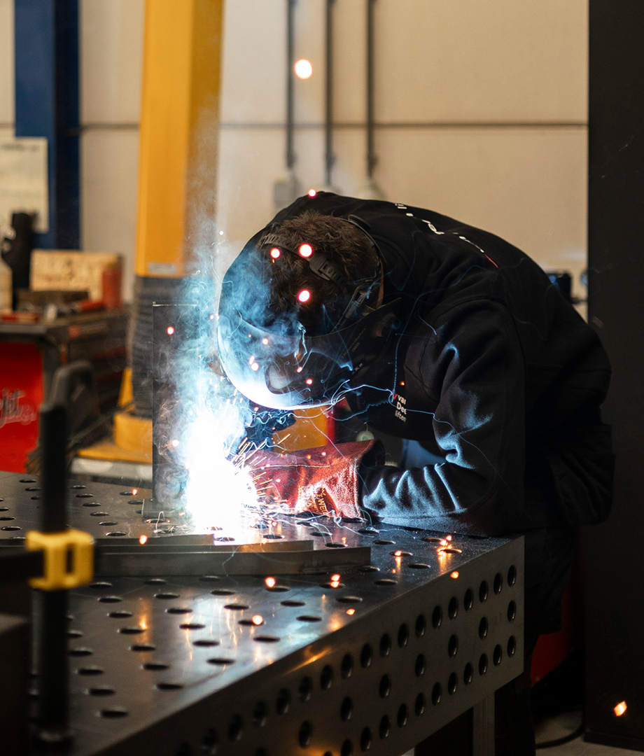
With preventive maintenance, timely renovation and fast service, Van Deelen Liften guarantees that the lifts of their customers function properly, are safe and offer an optimal user experience. Van Deelen Liften turns a properly functioning lift a matter of course and is known as the reliable partner in the Rotterdam and The Hague region.
Also view
One Flora Group
Merger between two major players in the floriculture sector
One Flora Group
KP Holland
Rebranding of breeders and producer of plants
KP Holland
Waaijerbouw
Increase visibility with a strong brand story
Waaijerbouw
Intellistore
Introduction to innovative storage and picking system
Intellistore
Veenpark Vastgoed Advies
From renovation of buildings to the brand renovation
Veenpark Vastgoed Advies
The Waterproof Company
Rebranding and launch of The Waterproof Company
The Waterproof Company
Meer Gevelsystemen
Complete rebranding for conceptions
Meer Gevelsystemen
Collaborate with vandeez ?
brand strategy ?
brand identity ?
website?
Brand activation?
get started with your
contact us
Erik den Blaauwen
operational manager
Every day we work on great projects: from local entrepreneurs to companies with international ambitions. We see companies grow because we let their brand shine again.
Wendy Groenewegen
brand strategist
That we can make visible impact for our clients makes me happy!
Dennis Damen
brand strategist
Very nice to bring out 'the gold' for so many organizations.
Christy van der Sman
owner
With our team we are your creative partner for the long term. Together we get things done. Each from his own expertise. Together we celebrate successes.
Sjoerd van Viegen
Art Director
Great concepts, new creations, enthusiastic clients, that is what makes me happy.
Mendy van der Hulst
designer
It is so cool that I see my designs on different websites, billboards and in advertisements.
Dennis de Baat
Digital Designer
We develop websites that our clients are proud of. It remains cool to think along and contribute to the growth of our clients.