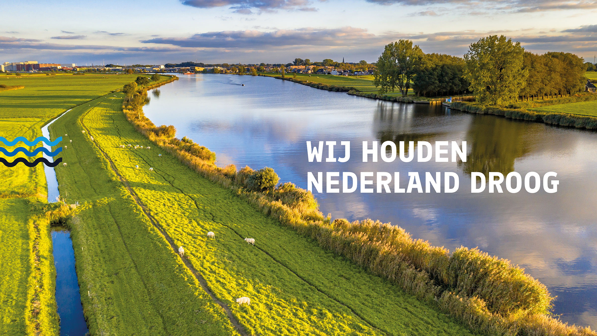
The first step in the rebranding was getting the ambition clear: VDE wanted to put himself as the specialist in sustainable waterproofing. The focus was on a wide audience: from homeowners with basement leaks to business clients in infrastructure.
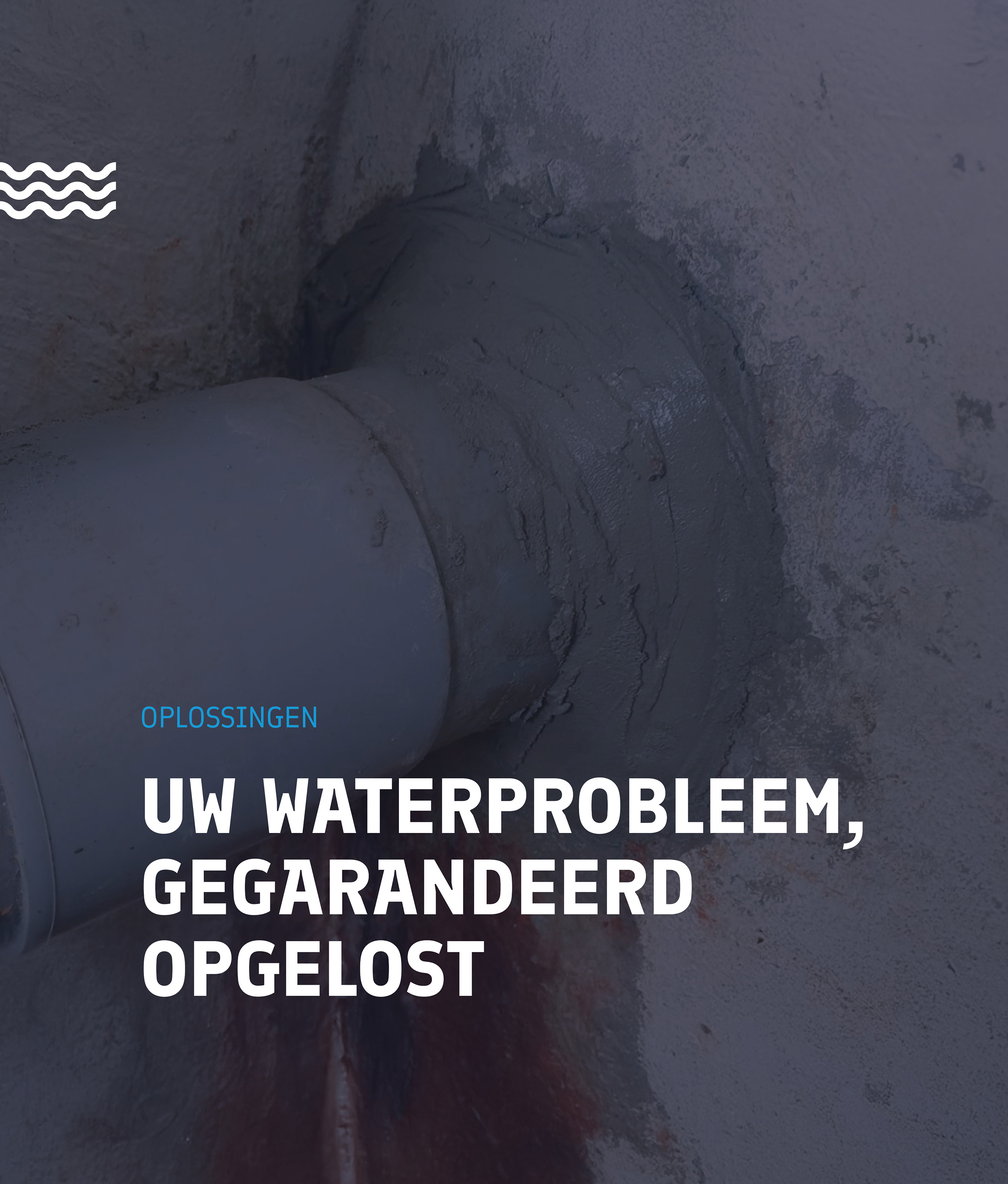
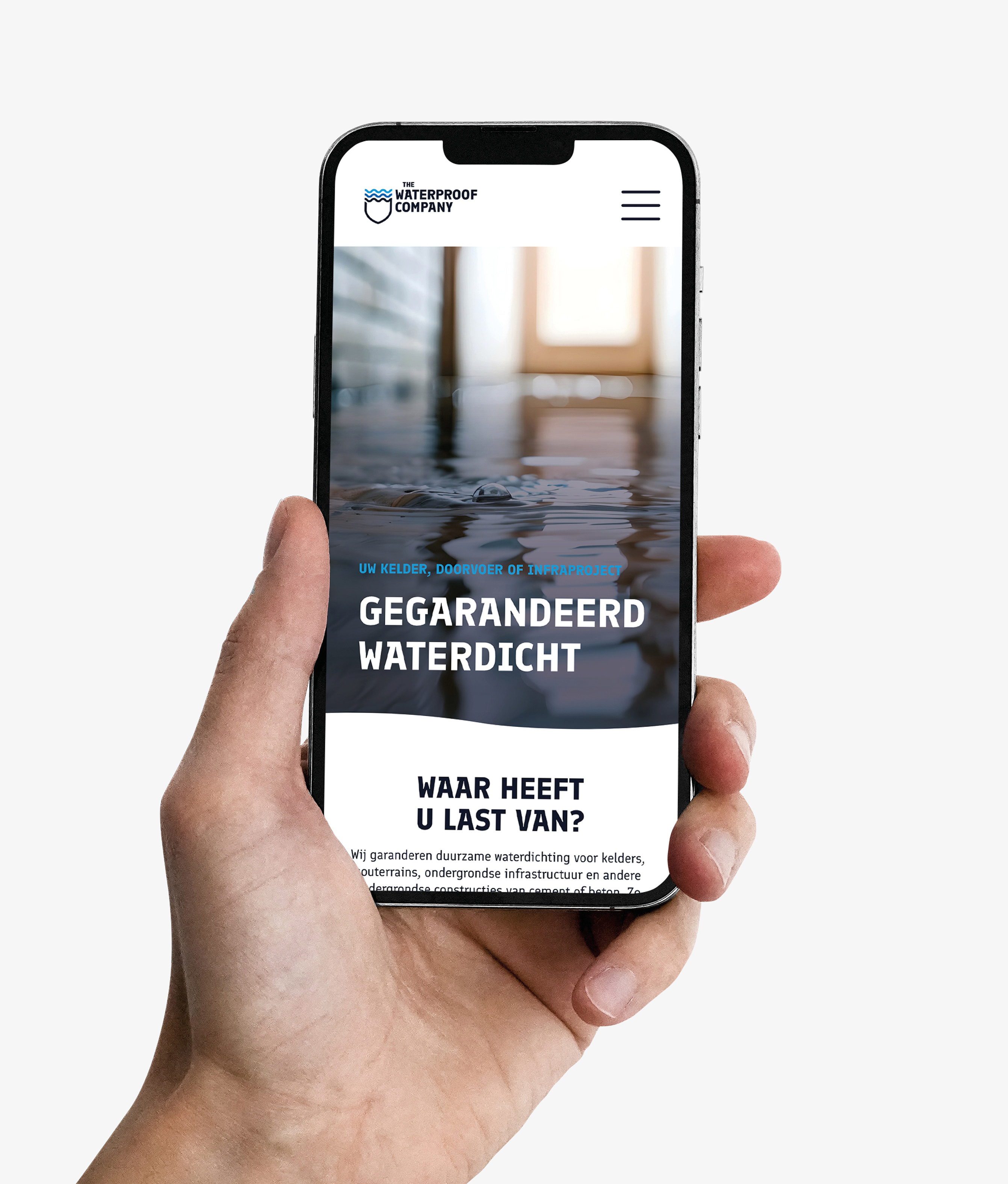
Guaranteed waterproof
Based on these insights, we developed a powerful brand compass that revolves around three values: certainty, expertise and sustainability and the mission to keep the Netherlands dry every day. With the brand promise: guaranteed waterproof, customers know that The Waterproof Company has a lasting solution for every water problem.
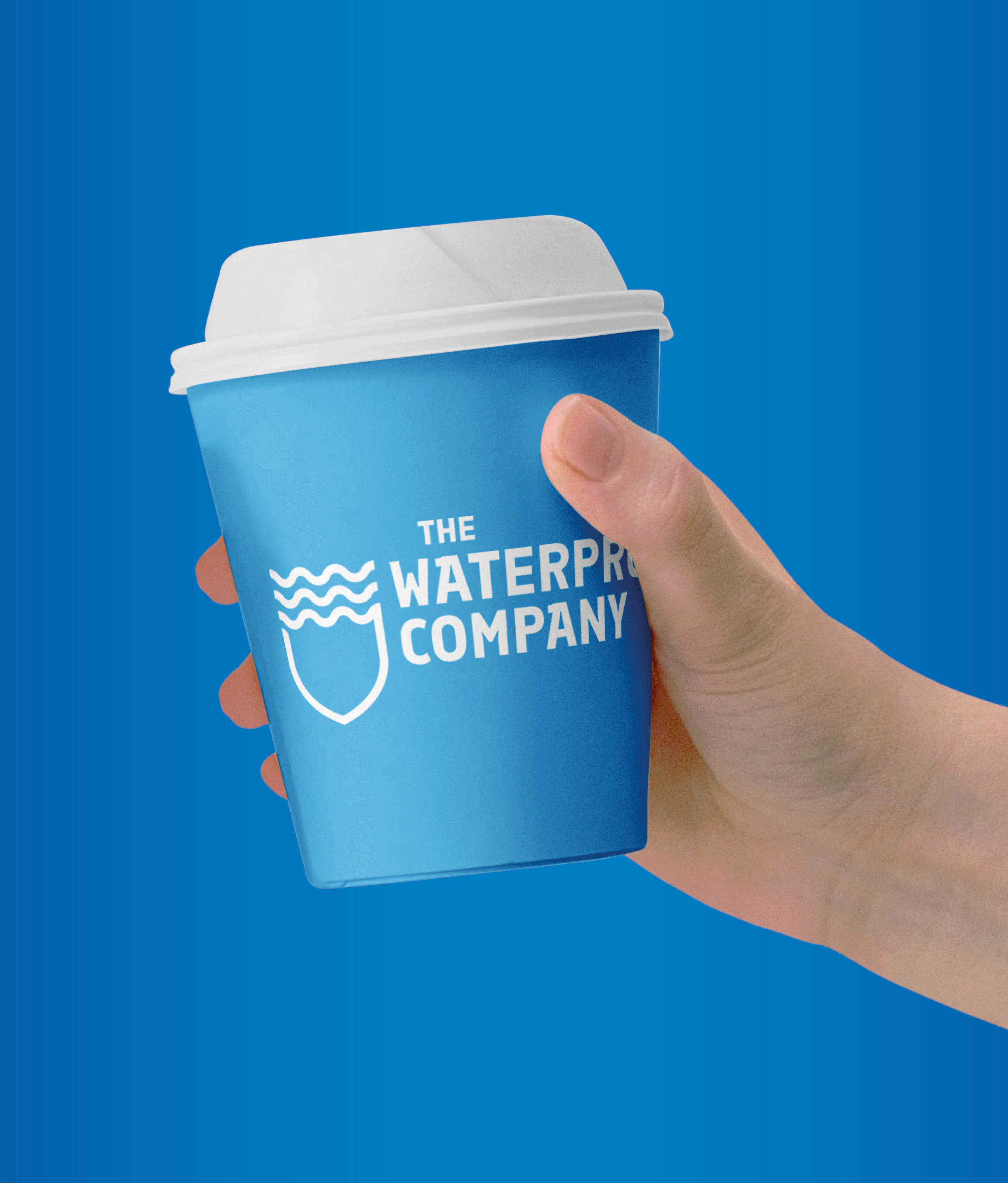
A new name and brand identity
The name The Waterproof Company says exactly what the company does: solve every water problem, sustainable and permanent. From cellars and implementation to underground infrastructure, customers get the certainty that their property is watertight again, with a 30 -year warranty.
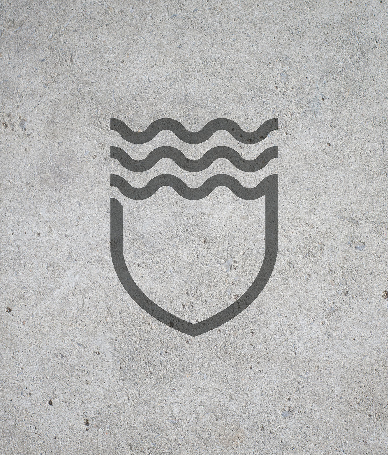
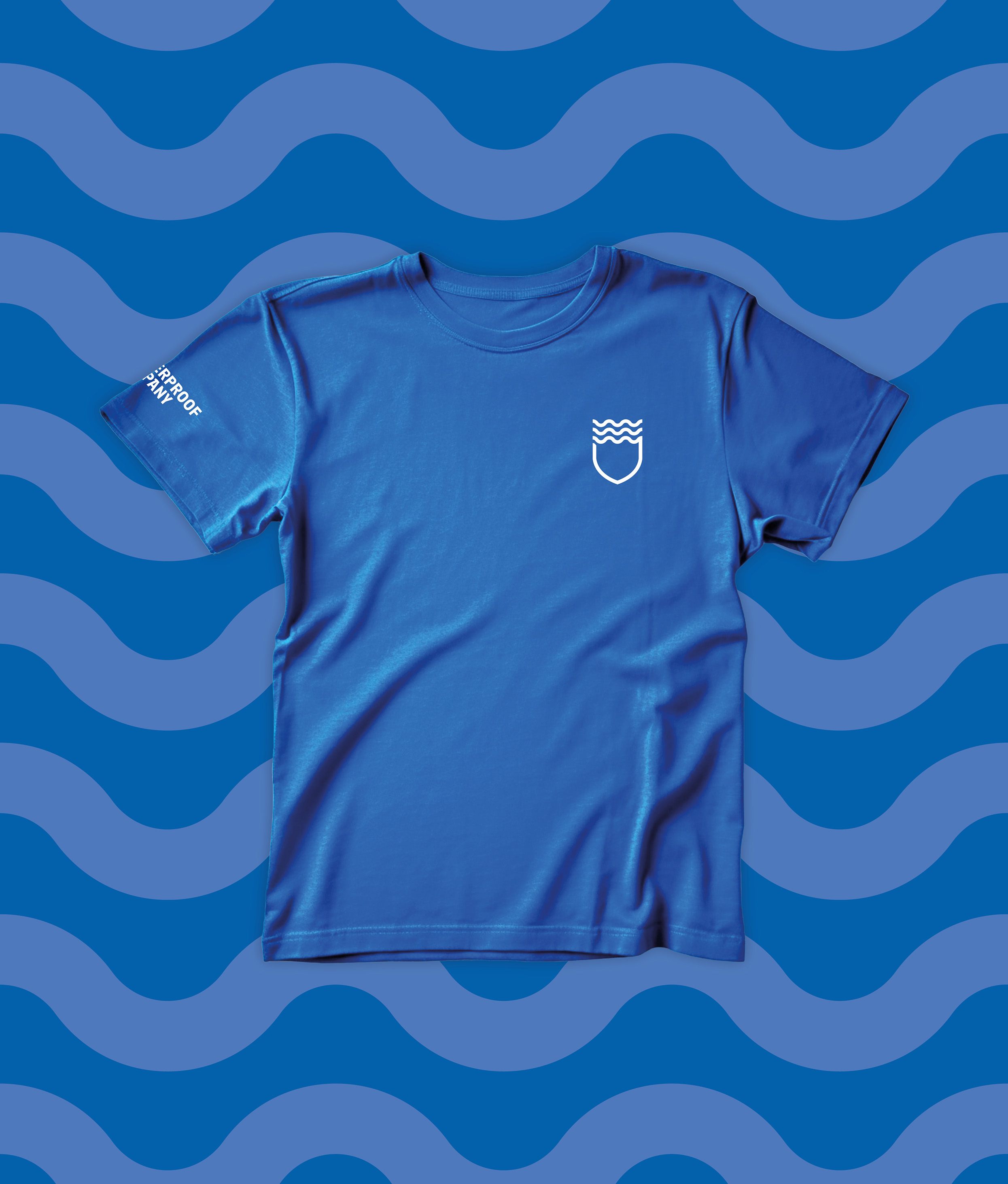
The new brand identity and the logo reinforces this message. The logo, a shield with three water waves, symbolizes the protection and security that The Waterproof Company offers. The waves, which move from open to closed, symbolize how they tackle every water problems: from leakage to sustainable protection.
The visual identity also consists of different shades of blue as primary colors and subtle green as a secondary color. These colors radiate trust, sustainability and expertise. The sturdy Font Finlandica gives all communication a professional and accessible look , with a subtle wave movement processed in the letter 'A' as a recognizable detail.
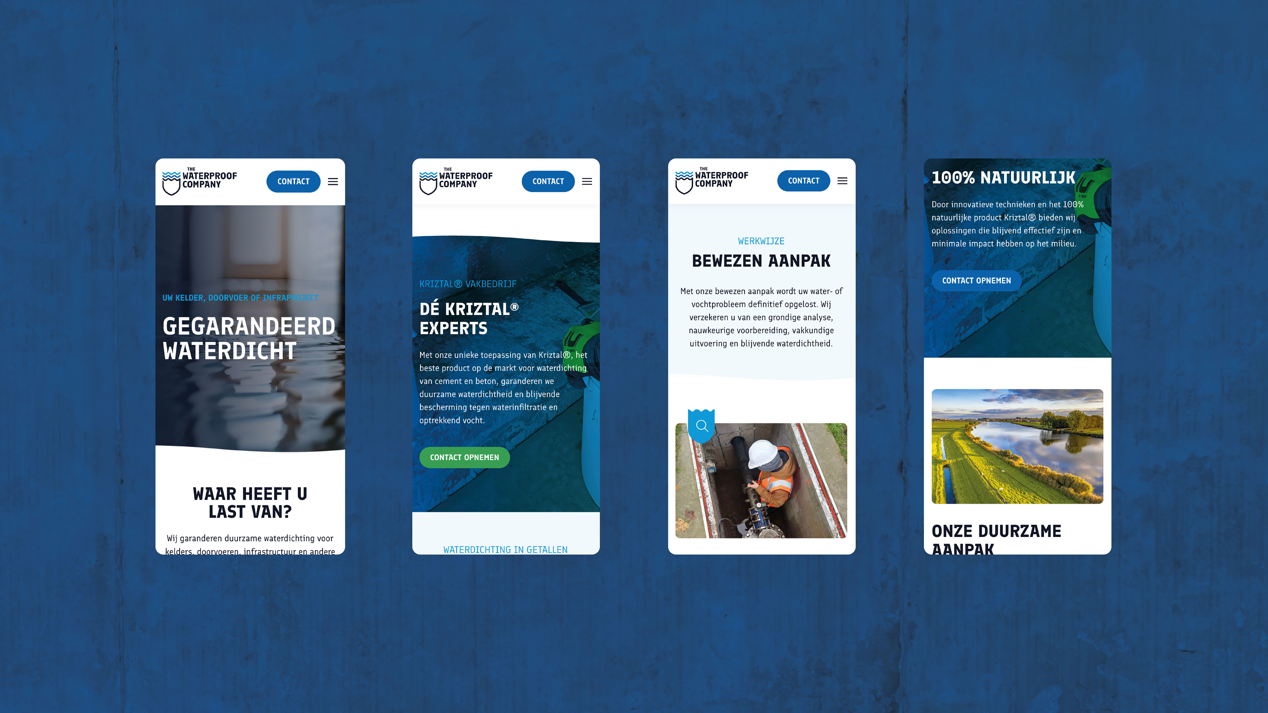
A user -friendly and convincing website
The new website is the digital heart of the brand. With a sleek design, clear texts and a well -arranged structure, visitors are immediately addressed. Both individuals and business customers effortlessly find what they are looking for: a specialist with a sustainable solution for their water problem.