-
 Christy van der Sman / Director

A brand only becomes recognizable if the logo in combination with all design elements are used consistently. Whether it is the design of a brochure, website or product. Everything forms a design-total experience, which we call the brand identity . It is the impression that your brand makes on people. But how do you ensure that your brand leaves the right impression? And how do you rate during the creation of your brand identity whether or not a design is good?
What do you think vandeez?
Design screams for a taste judgment. Non-designers quickly make a judgment like 'looks good' or 'I don't like that'. This taste judgment is very human and is mainly about the aesthetic attractiveness of a design. Is the design beautiful and does it fit my style and taste? Because the aesthetic side often first looks at the aesthetic side, the other side of the design medal often comes undesirably in the background, namely functionality. A functional design ensures that it matches the needs and goals of the target group. A strong design, from a company car to a billboard, is primarily functional and efficient.
It's not about whether or not the design is beautiful
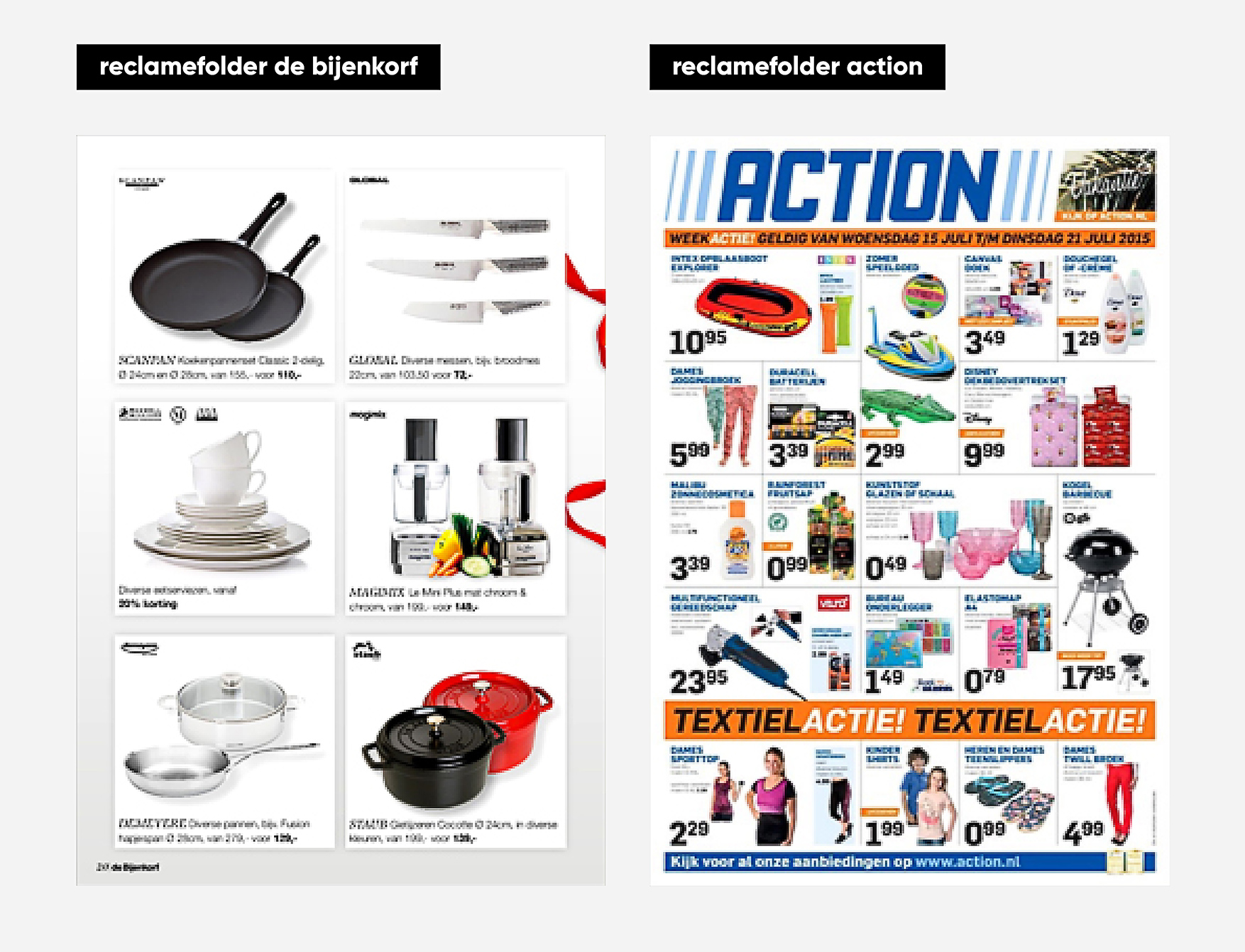
A simple but effective example of this comes from Wessel Jansen in his blog "About Design can be argued". In this blog he shows the difference between the advertising brochures of the Bijenkorf and Action. Both brands communicate the same message: discount. Only they do this with a completely different look : sale compared to promotion! Through informed design choices with regard to logo, color, shape and typography, both brands appeal to their target group and achieve their goal. It is not about whether or not the design is beautiful.
functional beauty
So in a design process, first ensure that the design meets the needs and goals of the target group before you look at the aesthetic attractiveness. With a powerful brand identity :
- Connect everything with the needs of your target group
- Hangs everything together
- and there is a consistent application
Does your complete brand identity meet this? Then you know that you have a brand identity that ensures individuality, recognition and sympathy. A look that adds value to your brand. A look with functional beauty.


